Version
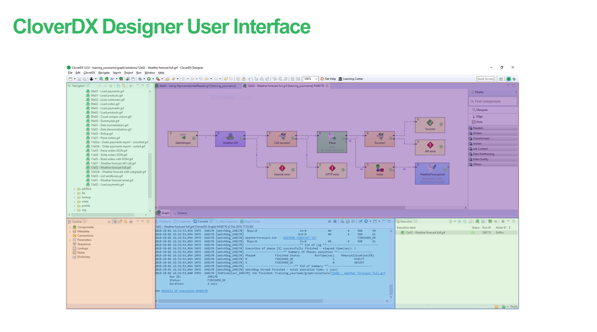
3. Designer default layout
The CloverDX perspective consists of 5 panes:
Figure 63. CloverDX perspective
-
Graph Editor with Palette of Components is in the upper right part of the window.
In this pane, you can create your graphs. Palette of Components serves to select components, move them into the Graph Editor, connect them with edges. This pane has two tabs. (See Graph editor with Palette of Components.)
-
The Project Explorer pane is in the upper left part of the window.
There are folders and files of your projects in this pane. You can expand or collapse them and open any graph by double-clicking its item. (See Project Explorer pane.)
-
The Outline pane is in the lower left part of the window.
The pane contains all parts of the graph that is opened in the Graph Editor. (See Outline pane.)
-
The Tabs pane is in the bottom of the window.
You can see the data parsing process in these tabs. (See Tabs pane.)
-
Execution tab is in the right bottom corner.
You can see the details of graph execution here.
Graph editor with Palette of components
The Graph Editor with Palette of Components is the most important pane for graph design.
Palette
The Palette contains components to be placed into Graph Editor and tools to work with them. The Palette enables you to select a component and paste it into the Graph Editor. Beside above mentioned components the Palette contains tools for placing notes and edges and for selection of components.
To find the component in Palette, use the Filter. The filter is placed at the top of the Palette. Start typing the component name into the input field of the filter and the component list is being filtered on the fly.
The Palette is either opened after CloverDX Designer has been started or you can open it by clicking the arrow which is located above the Palette label or by holding the cursor on the Palette label.
You can hide the Palette again by clicking the same arrow or even by simple moving the cursor outside the Palette tool.
You can even change the shape of the Palette by shifting its border in the Graph Editor and/or moving it to the left side of the Graph Editor by clicking the label and moving it to this location.
Placing components from Palette
To paste a component, you only need to click the component label, move the cursor to the Graph Editor and click again. After that, the component appears in the Graph Editor.
Another way to place a component into the Graph editor pane is to drag the component from the Palette and drop it on a place you want.
All components of the graph can be viewed in the Outline pane.
Once you have selected and pasted more components to the Graph Editor, you need to connect them with edges.
Components in Palette
CloverDX Designer provides all components in the Palette of Components. However, you can choose which should be included in the Palette and which not. If you want to choose only some components, select from the main menu.
Expand the CloverDX item and choose Components in Palette.
In the window, you will see the categories of components. Expand the category you want and uncheck the checkboxes of the components you want to remove from the palette.
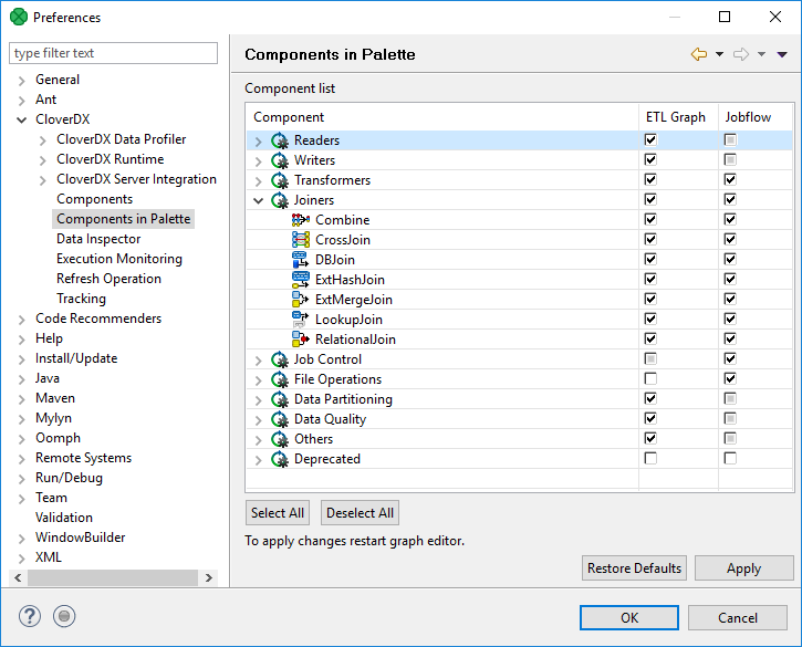
Figure 64. Removing components from the Palette
Then you only need to close and open the graph and the components will be removed from the Palette.
Using edges
To connect two components by an edge choose the edge label in the Palette, click the output port of the first component and click on the input port of the second component. This way, the two components will be connected. Once you have terminated your work with edges, click the Select item in the Palette window.
Saving the graph
After creating or modifying a graph, you should save it. Save the graph by selecting the Save item from the context menu or by using the Save button in the File menu or by Ctrl+S.
Closing graphs
If you want to close any of the graphs that are opened in the Graph Editor, you can click the cross on the right side of the tab. If you want to close more tabs at once, right-click any of the tabs and select a corresponding item from the context menu. There you have the items: Close, Close other, Close All, and other items.
Rulers
Rulers serve to align the components.
Rulers can be switched on from the main menu. Select the CloverDX item (make sure the Graph Editor is highlighted) and turn on the Rulers option from the menu items.
To align the components using rulers, click anywhere in the horizontal or vertical rulers. Vertical or horizontal lines will appear. Then, you can drag any component to some of the lines; once the component is dragged to it by any of its sides, you can move the component by moving the line.
When you click any line in the ruler, it can be moved throughout the Graph Editor pane.
Grid
Grid helps you to align components.
The grid is switched on or off from the main menu. To switch on the Grid, select the CloverDX item (make sure the Graph Editor is highlighted) and click on the Grid item in the menu.
After that, you can use the grid to align components as well. As you move them, the components snap to the lines of the grid by their upper and left sides.
Graph auto-layout
By clicking the Graph auto-layout item, you can change the layout of the graph - the components are aligned to the top left corner of the view.
Selecting components
When you push and hold down the left mouse button somewhere inside the Graph Editor and drag the mouse throughout the pane, a rectangle is created. When you create this rectangle in such a way so as to surround some of the graph components and then release the mouse button, you can see that these components have become highlighted. (All components in the graph below.)
Making components aligned
If at least two components are selected, six buttons (Align Left, Align Center, Align Right, Align Top, Align Middle and Align Bottom) appear highlighted in the tool bar above the Graph Editor or Project Explorer panes. (With their help, you can change the position of the selected components.) See below:
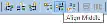
Figure 65. Six new buttons in the Tool Bar appear highlighted (Align middle is shown)
Alternatively, you can right-click inside the Graph Editor and select the Alignments item from the context menu. Then, a submenu appears with the same items as mentioned above.
Copying and pasting of parts of a graph
Remember that you can copy any highlighted part of any graph by pressing Ctrl+C and subsequently Ctrl+V after opening some other graph.
Source
The Source tab contains the source of the graph. The tab does not require editing.
The name of the user that has created the graph and the name of its last modifier are saved to the Source tab automatically.
Project Explorer pane
In the Project Explorer pane, there is a list of your projects, their subfolders and files. You can expand or collapse them, view them and open.
Opening Graphs from Project Explorer pane
All graphs of the project are situated in this pane. You can open any of them in the Graph Editor by double-clicking the graph item.

Figure 66. Project Explorer pane
|
Compatibility
In 5.10.0, the deprecated Navigator pane was replaced with Project Explorer in the default CloverDX perspective. |
Outline pane
The Outline pane contains a list of all elements of the currently used graph.
-
Ports - list of connected input and output ports. Available in subgraphs only. See Optional Ports
-
Components - list of components used in the selected graph. See Components
-
Metadata - list of metadata assignable to edges in selected graph. See Metadata
-
Connections - list of connections used in the graph. See Connections
-
Parameters - See Parameters
-
Sequences - See Sequences
-
Lookups - See Lookup Tables
-
Notes - See Notes in Graphs
-
Dictionaries - See Dictionary
-
Configuration - See Execution Properties
The graph components, edges metadata, database connections or JMS connections, lookups, parameters, sequences, and notes are editable from the Outline. You can both create internal properties and link external (shared) ones. Internal properties are contained in the graph and are visible there. You can externalize the internal properties and/or internalize the external (shared) properties. You can also export the internal metadata. If you select any item in the Outline pane (component, connection, metadata, etc.) and press Enter, its editor will open.
|
Activate the Link with Editor yellow icon in the top right corner and every time you select a component in the graph editor, CloverDX will select it in the Outline as well. Although this is convenient for smaller graphs, turning it off for complex graphs prevents the Outline from expanding the big list of components repeatedly when you are working in the graph. |
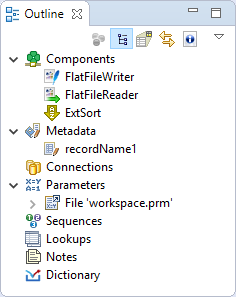
Figure 67. Outline pane
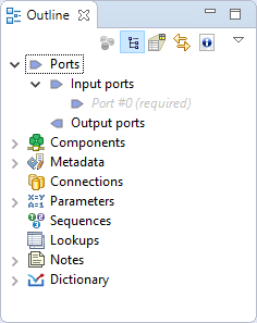
Figure 68. Outline pane - Subgraphs
Outline pane buttons
The Outline pane Buttons affect what is being displayed in the Outline. There are two buttons in the upper right part of the Outline switching between Tree View and Graph Minimap, and the Link With Editor button.
Tree view
In the tree view you can see the tree of components, metadata, connections, parameters, sequences, lookups and notes. Tree View is the default Outline view.
Graph minimap
The Graph Minimap is an Outline view not displaying the graph elements but the preview.
To switch to the Graph Minimap use the second button from the left in the top of the Outline.
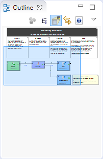
Figure 69. Outline pane with minimap
You can see a part of some of the example graphs in the Graph Editor and the same graph structure in the Outline pane. In addition to it, there is a light-blue rectangle in the Outline pane. You can see exactly the same part of the graph as you can see in the Graph Editor within the light-blue rectangle in the Outline pane. By moving this rectangle within the space of the Outline pane, you can see the corresponding part of the graph in the Graph Editor as it moves along with the rectangle. Both the light-blue rectangle and the graph in the Graph Editor move equally.
You can do the same with the help of the scroll bars on the right and bottom sides of the Graph Editor.
To switch to the tree representation of the Outline pane, you only need to click the first button from the left in the upper right part of the Outline pane.
Link with editor
Link With Editor button switches on a link between the currently selected element from the Outline and the currently selected element from the Graph Editor. If you click on a component in Graph Editor and this option is enabled, the component will be highlighted in the Outline too.
Show element IDs
Show Element IDs shows or hides element IDs of graph elements (components, metadata, etc.) in Outline. Element ID is displayed behind the corresponding element name.
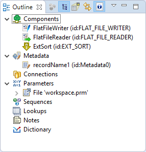
Figure 70. Show element ID enabled
Cleanup unused elements
Graph Cleanup assists you in removing unused elements from a graph. The dialog helps you to remove unused metadata, connections, sequences or lookup tables or dictionaries, but it does not remove unused parameters. The removal of unused parameters might affect other graphs in the project.
The Graph Cleanup can be opened by right click from the Outline pane or Graph Editor pane using Cleanup unused elements option.
If you open the dialog, the unused parameters will be preselected. You can deselect any of preselected items or add any item or items.
The Graph Cleanup dialog contains buttons to Select all elements, to Deselect all elements and to Reset to default selection of elements.
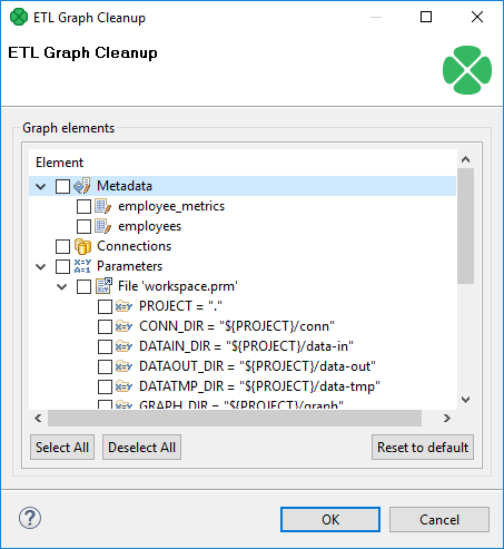
Figure 71. Graph Cleanup
Locking elements
In Outline, you can lock any of the shared graph elements. A lock is a flag (with an optional text message) that you deliberately assign to an element so that others are notified that they should not attempt to modify the element. These graph elements can be locked
-
Metadata
-
Connections
-
Sequences
-
Lookups
How to lock
To lock any of these elements, right click it in Outline and click Lock.
Provide a message to be displayed if a locked item is being edited. You can use the default one.
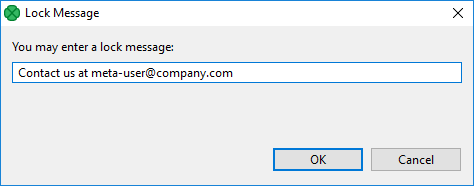
Figure 72. Locking an element - Message dialog
|
Lock is not a security tool - anyone can perform unlock and locks are not owned by users. |
Locked elements
In various places (such as the Transform Editor), you are warned if you are accessing a locked element, e.g. modifying locked metadata.
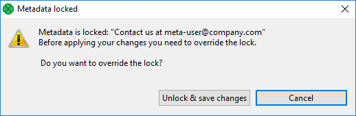
Figure 73. Accessing a locked graph element - you can add any text you like to describe the lock.
Tabs pane
In the lower right part of the window, there is a series of tabs.
|
If you want to extend any of the tabs in a pane, simply double-click the tab. After that, the pane will extend to the size of the whole window. When you double-click it again, it will return to its original size. |
Properties tab
In the Properties tab, you can view and/or edit the component properties.
When you click a component, properties (attributes) of the selected component appear in this tab.
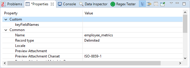
Figure 74. Properties tab
Note that the best way to edit properties of the component is to double-click the component. A more powerful Edit component dialog will be shown and will allow you to edit settings of your component in more comfortable interface.
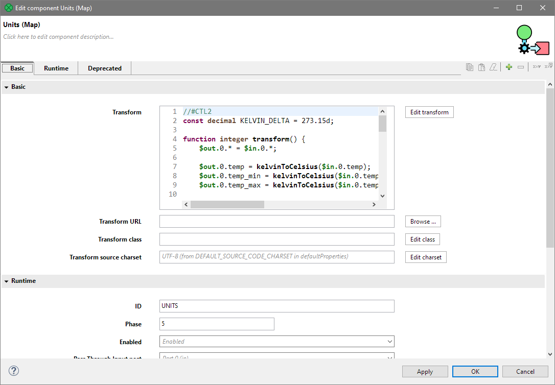
Figure 75. Edit component dialog.
Console tab
In this tab, the process of reading, unloading, transforming, joining, writing, and loading data can be seen.
By default, Console opens whenever CloverDX writes to stdout or stderr.
You will see the stdout or stderr in the tab.
Console preferences
If you want to change it, you can uncheck any of the two checkboxes that can be found when selecting . Expand the Run/Debug category and open the Console item.
To avoid switching to the console, uncheck the Show when program writes to standard out and Show when program writes to standard error checkboxes.
Check buttons
Two checkboxes that control the behavior of Console are:
-
Show when program writes to standard out
-
Show when program writes to standard error
Note that you can also control the buffer of the characters stored in Console:
There is another checkbox (Limit console output) and two text fields for the buffer of stored characters and the tab width.
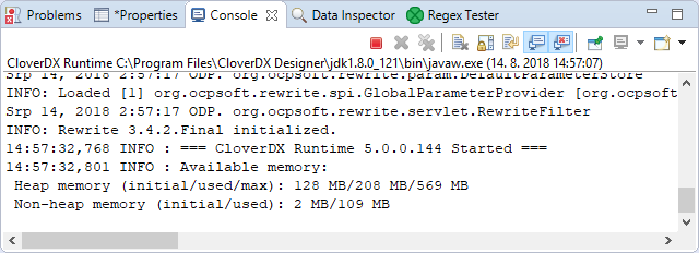
Figure 76. Console Tab
Problems tab
In this tab, you can view error messages, warnings, etc.
When you expand any of the items, you will see their resources (name of the graph), paths (path to the graph) and location (name of the component).
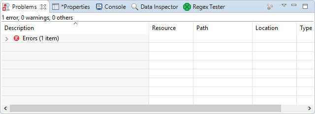
Figure 77. Problems tab
Regex Tester tab
In this tab, you can work with regular expressions.
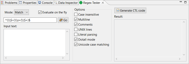
Figure 78. Regex Tester tab
You can paste or type any regular expression into the Regular expression text area. Content assistant can be called out by pressing Ctrl+Space in this area.
You need to paste or type the text to be matched into the pane below the Regular expression text area. After that, you can compare the expression with the text.
You can either evaluate the expression as you type, or you can uncheck the Evaluate on the fly checkbox and compare the expression with the text upon clicking the Go button. The result will be displayed in the pane on the right.
The Regex Tester can work in one of three modes.
-
Select Find if you want to find a substring matching the expression.
-
Select Split if you want to split the text according to the expression.
-
Select Match if you want to check for an exact match.
You have at your disposal a set of checkboxes. Some options are checked by default.
From the Regular expression you can generate CTL code by clicking on the Generate CTL code button, the dialog with generated CTL will open and you can copy the CTL from there.
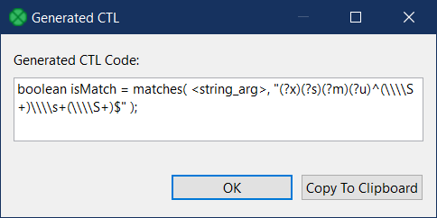
Figure 79. Generated CTL code
More information about regular expressions and provided options can be found at the following site: http://docs.oracle.com/javase/8/docs/api/java/util/regex/Pattern.html
Execution tab
Execution tab displays details of execution of a graph and its subgraphs. You can connect to CloverDX Server and see details of the graph run. See Connecting to a running job.
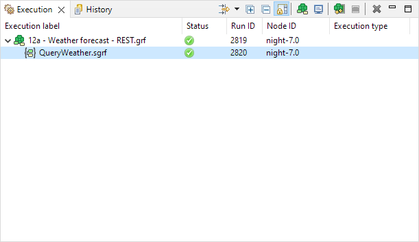
Figure 80. Execution tab of a graph running on CloverDX Designer
Execution label
Execution label is the name of a graph or particular subgraph components.
Status
Status shows which parts of a graph are waiting, running, successfully completed or which failed.
Run ID
Run ID is an identifier of a graph run, or an identifier of the run of a subgraph component.
Node ID
Node ID is an identifier of the node on which graph runs. This column is available for server runs only.
Execution type
Execution type displays node allocation on Clustered graph runs.