Version
Working with data
In this section we’ll cover how you can work with your data in the Data Manager – how to edit values in cells, how to see the past changes, approve them and so on.
No technical skills are needed when working with data in the Data Manager – the only requirement is that you understand the domain of the data and know how to fix issues flagged by the validation processes that load the data into the Data Manager.
Row lifecycle
Rows in each data set go through a row lifecycle with multiple milestones that provide additional information about the row status – whether is a new row, whether it has been already approved etc. This is called row status, and it is tracked in a special, system-defined column called Status.
The Status column is available in every data set and cannot be removed (although it can be hidden). The lifecycle of a row is not customizable – all rows must follow the same predefined statues, and it is not possible to add new ones. This means that regardless of your exact use case, you’ll see just the statuses as described below.
Four different basic statuses and one supplementary status are defined in the Data Manager:
| Row status | Description |
|---|---|
|
|
New row that has not been worked on yet. |

|
This status means that the Data Editor user considers the row finished from their point of view (regardless of whether they made any change to the data or not). Use the Mark as Edited row action to switch the row to the Edited status. |

|
The row been reviewed by an Approver user who considers the row to be done so that it does not require any further actions in the Data Manager’s editor. Use the Approve row action to switch the row to the Approved status. |

|
The row has been picked up by a CloverDX graph after its approval and has been successfully loaded to the target system. The row cannot be edited anymore, and its status cannot change. Once the Data retention period for the row is up, the row will be completely removed from the Data Manager. There is no row action to switch the row to Committed status. This is done by CloverDX component DataSetCommit in a graph. |

|
An extended status flag which means that the row has been marked for deletion. Row can have any status (New, Edited, Approved or Committed) and be Deleted at the same time. I.e., for deleted rows you will see two status “pills” in the |
The Status can be changed with various row actions on the Data Editor screen as well as with CloverDX jobs (e.g., graphs). The row actions are available as buttons on the right side of each row in the data grid or via context-sensitive actions in the toolbar.
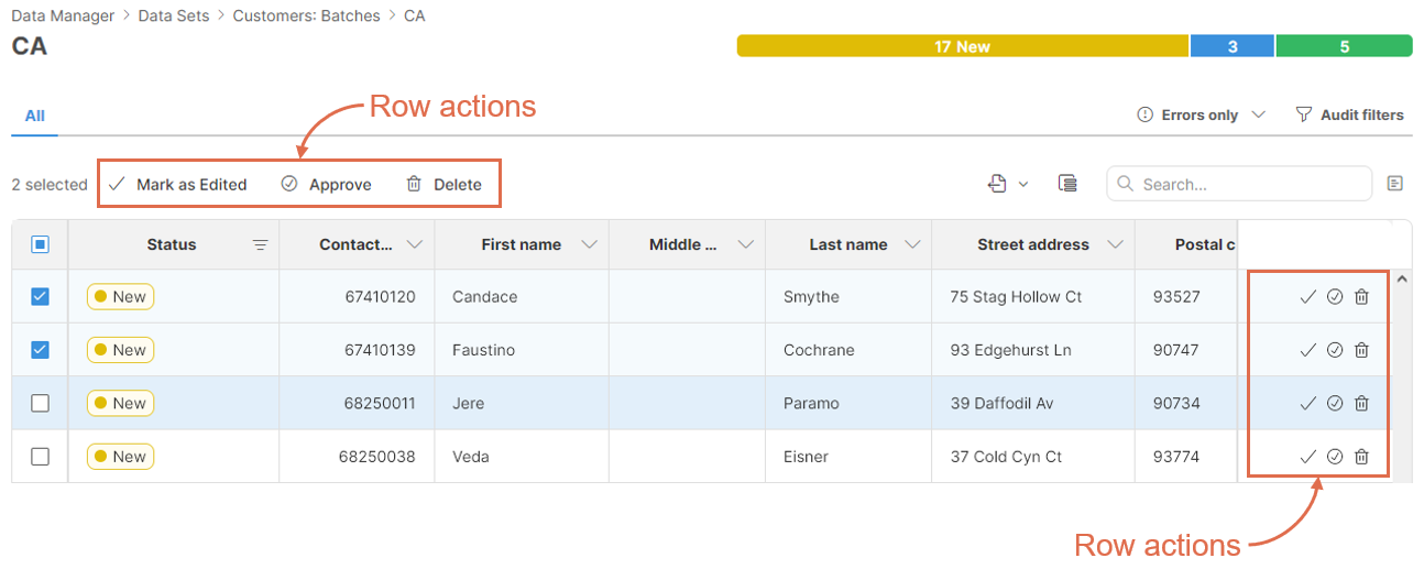
Figure 82. Where to find row actions on the Data editor screen.
Row actions on the toolbar allow you to work with multiple rows at once – all selected rows will be affected. The row actions in the data grid always only apply to a single row regardless of the row selection.
Following row actions are available:
| Row action | Statuses | Description |
|---|---|---|
|
New → Edited |
Switch the row to the Edited status to signal that the Data editor user considers their work on the record done. |
|
Edited → New |
Revert to New status to allow the Data editor user to reconsider their changes. |
|
New → Approved |
Approve the row to signal that it has been reviewed and is considered valid. You can approve row from New or from Edited status. |
|
Approved → Edited |
Revert the Approver’s decision to allow Data editors or Approvers to edit the row again. |
|
New → New + Deleted |
Mark the row for deletion. This can be done in New or Edited status if the row is not Deleted. |
|
New + Deleted → New |
Remove the “deleted” mark from the row. This can be done in New or Edited statues if the row is marked as Deleted. |
Note that there are no row actions to switch the row to Committed status. This can only be done with CloverDX jobs to signal that the row has been processed and can be removed from the data set once its retention period expired.
The statuses can only be modified in certain ways. Use the following diagram as a guide for the allowed state transitions:
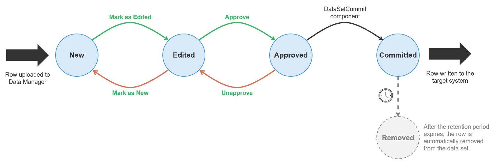
Figure 83. Row lifecycle diagram showing different statuses and possible transitions between them.
All transitions between states are accessible as actions in Data Manager’s editor except for the transition to Committed status which can only be done by the DataSetCommit component.
Note that you can delete a row only when it is in New or Edited status. Approved and Committed rows cannot be deleted.
The rows are not stored in the Data Manager’s database forever. Instead, once the row is committed (which means it has been fully processed), its retention age is evaluated. The retention age is measured as the time elapsed since the row was committed. If the retention age is greater than the retention period for the data set, the row is deleted from the database. Row audit and all associated data is deleted at the same time as well. The row cannot be recovered once its retention period expires.
The retention period can be configured in the data set’s Configuration screen and is measured in days. See Basic data set properties section for additional details.
Editing data in Data Manager
Data Editor screen
Data is edited on Data Editor screen which is shown when you click on a data set or data set batch.
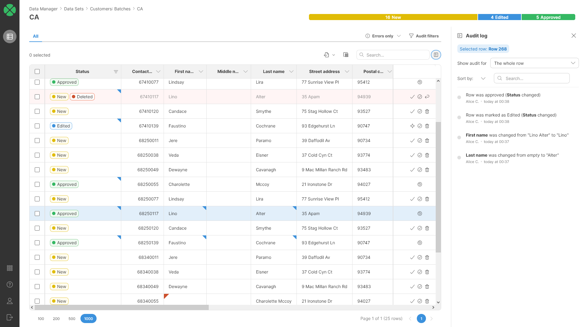
Figure 84. Data Editor screen showing the data grid and audit side bar.
The main part of the screen is taken by the editor grid (or data grid). The grid shows data in the data set as a simple table with columns shown in the same order as the order defined in the data set layout.
The first column is the row selector column which allows you to select multiple rows by checking the checkboxes. Once multiple rows are selected, you can perform mass actions on those rows via row actions on the toolbar (see below for more details).
All the other columns contain data and are ordered as configured in the data set layout. On the screenshot above, the Status column is the first data column, but this does not have to be the case since the column can be positioned anywhere in data set’s data layout.
Each column shows additional information in its header:
| Column header | Description |
|---|---|

|
Regular column without any additional flags. The column data is editable. |

|
The pencil icon shows that the column is read-only and cannot be changed. |

|
The key icon shows that the column is configured as batch key column. There can be either one or no batch key column in a data set depending on whether the data set has batching enabled or not. |

|
Batch key and read-only indicators can be combined and designate a column that is a read-only batch key. |

|
The arrow up (or down) indicates that the row is used to sort data in the data editor. See additional details in the Sorting the data section below. Note that sort indicators can be combined with other icons in the header. |
Data editor uses different background colors to provide additional information about the row. Following screenshot show different background colors you may see in the data grid:
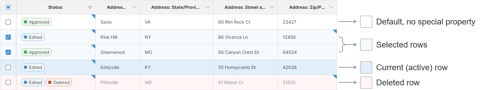
Figure 85. Colors in the data grid provide additional information about the row.
Most rows typically use the default color (white) to denote that they do not have any special property.
There can be any number of selected rows while there is always at maximum one current (or active) row. The current row is the one where you are currently making changes. Rows can be highlighted as current by either clicking into a cell to edit its value or by performing any other action on the row (e.g., click on the status, click on one of the row actions etc.).
Deleted rows are highlighted in red to make them stand out more. There can be any number of deleted rows.
Data editor grid shows additional information about data in each cell in the form of colored markers in the cell corners:
| Cell | Cell with tooltip | Description |
|---|---|---|

|
Cell without any markers. |
|

|

|
Cell with a red error marker in the top left corner. Error marker shows that there is an error message attached to the value in the cell. Error message is shown in a tooltip when mouse hovers over the cell. |

|

|
Cell with a blue change marker designating that the cell value has been modified. Additional information about the value is available in tooltip or in the Audit log side bar. |
How to edit data
To edit data in the data grid, simply click into a cell you wish to change. It the cell is in a column that is editable, you will be able to modify the value of the cell. Note that Approved or Committed rows are read-only and values of their cells cannot be changed regardless of whether the columns are editable or not.
The editor behaves differently depending on whether the column you are trying to edit is restricted to a lookup or not (see Data Layout section for more details).
Columns without lookups
If the column is not restricted to a lookup, editing a cell will bring an editor that depends on the data type:
| Column type | Cell editor |
|---|---|
boolean |
|
date |
You can either type the date or use the provided date-time picker dialog. The dialog allows you to pick any date and time with precision to a minute (i.e., you cannot change seconds or milliseconds even though the Data Manager backend does support such precision for datetime values). |
decimal |
You must write decimal numbers without any formatting. You cannot use thousands separators, currency symbols or any other special characters. A decimal point must be used. |
integer |
You must write integer numbers without any formatting. You cannot use thousands separators, currency symbols or any other special characters. |
string |
Write any string, including national characters (even emoji). Unicode is used to represent the data internally, so any national and many thousands of special characters can be handled without any issues. |
Columns with lookups
For columns with lookups, you will only be allowed to pick a value from the lookup associated with the column. The lookups are displayed in a dialog or a dropdown box depending on the lookup configuration:
-
Simple drop-down will be shown when the lookup only contains value (the lookup key) and a label. For example, list of countries can use country code as the key and country code name as the value:

-
A more complex table which can show additional columns alongside the lookup value and label. These additional columns provide context that you can use to better pick the value since you can compare the extra columns with the information in the main data grid:

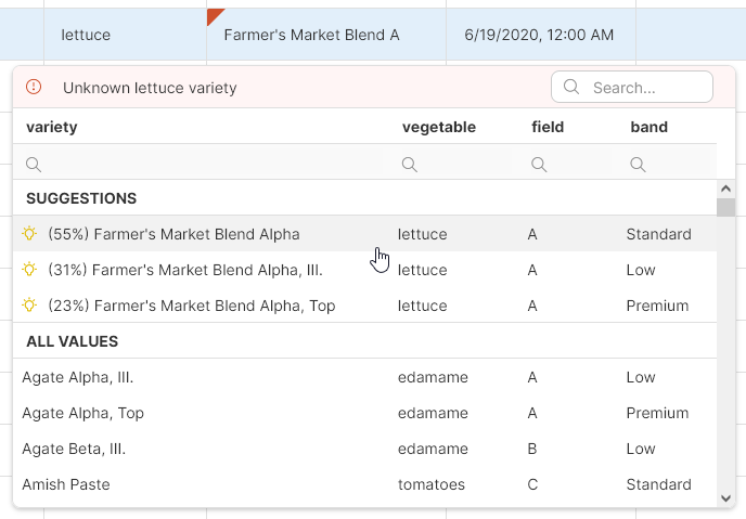
Additionally, if the cell that you are trying edit contains an error, you will see the error message in the dialog and you may also get suggestions which can provide guidance for selecting the best item from the list.
The suggestions are displayed as the first items in the dialog and use the lightbulb icon so that you can easily distinguish them from the remaining items in the lookup.
Regardless of how the dialog is displayed, you can use the search box to find the items you are looking for. You can also resize the dialog by dragging the edges or corners or move the dialog by dragging it by its header. The dialog will also stay open if you click on the scrollbars so that you can scroll within your data set (this is mainly useful in wide data sets with many columns where you may have to scroll to see the additional columns that can help you select the correct item from the lookup).
Sorting the data in the data grid
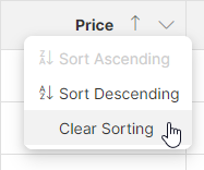
You can sort rows in the data set by left clicking on the header of the column you’d like to sort by. The header will change to reflect the sorting status of the column. Clicking on the header will toggle the sort order between ascending and the descending. Note that the sorting order is used only when showing the data in the grid, it does not affect the order in which rows are stored in the Data Manager’s storage and does not affect the order in which rows are read using the DataSetReader component.
-
Sort in ascending order (smallest to largest):
-
Sort in descending order (largest to smallest):

To reset the sorting, right click the column and select the Clear sorting item from the context menu.
It is also possible to sort based on multiple columns. To add a column as a sorting key, hold the Shift key when you left click the column header. The order in which the columns were added defines the order of the columns in the sort key – this is shown as little numbers to the right of the sort direction arrow for given column:
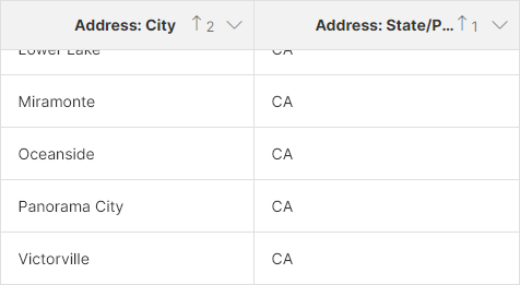
Figure 86. Data grid header showing data sorted by the
State column and then by the City column.To change the sorting direction of a column when sorting by multiple columns, Shift + click the column header.
Filtering the data
To help you find the data you’d like to work with, the editor screen offers multiple ways of filtering your data. You can filter based on column values, presence of errors, past changes in the data and more.
The filtering is configured using multiple controls on the data editor screen:
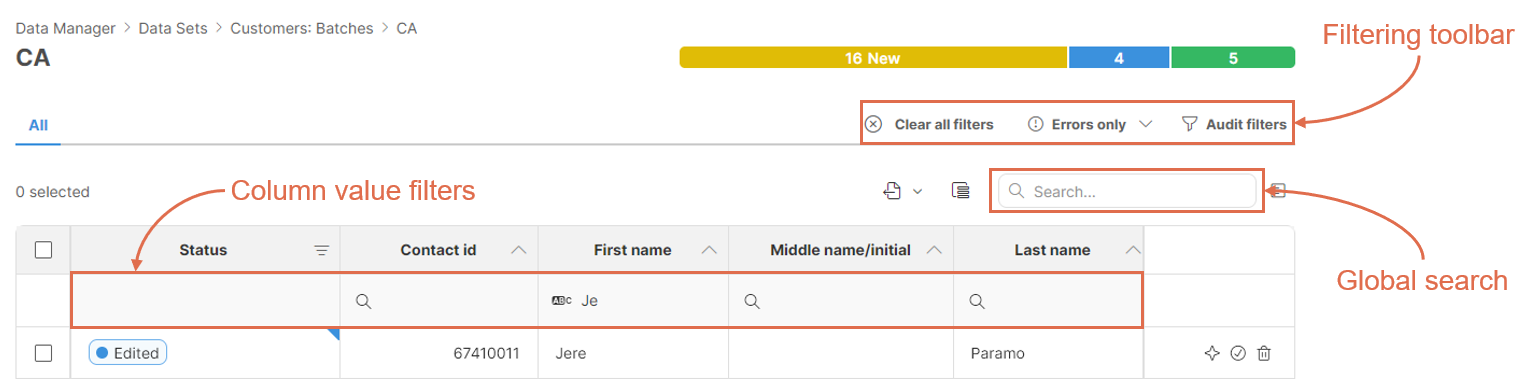
Figure 87. User interface elements on the data editor screen that allow you to configure variety of filters.
If any filtering is enabled, the toolbar will show Clear all filters button that allows you to reset all filters and show the whole data set. The button will appear in the upper right section of the toolbar next to the Errors only and Audit filters:

Note that if multiple filter types are enabled, they are all combined and only the rows that satisfy all filtering conditions will be shown in the editor.
Global full-text search
Global search is a full-text search box in the top-right corner right above the editor grid. Typing into the box will filter in real-time in the whole data set (i.e., even if the data set contains more data than what is currently displayed).
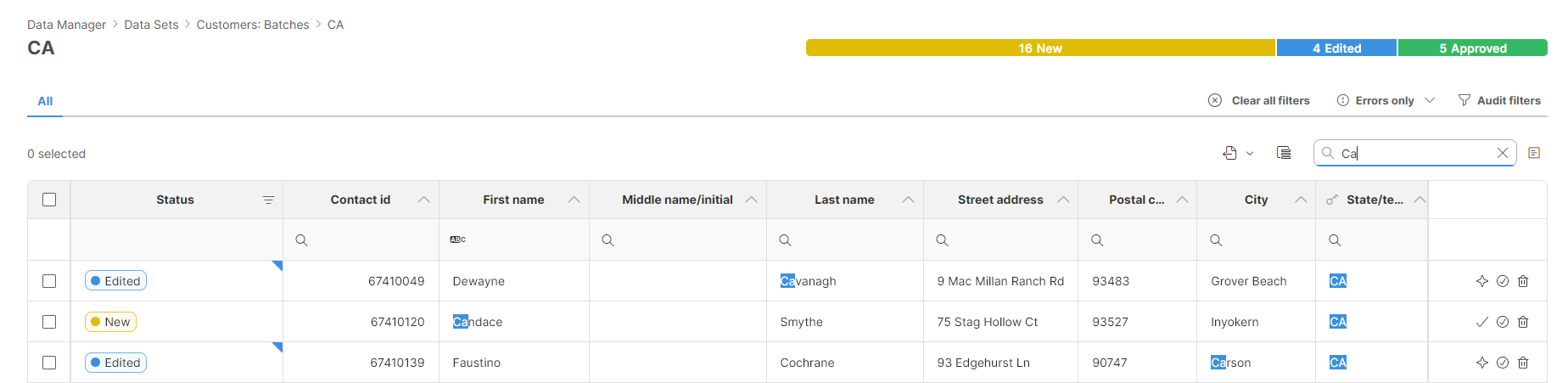
Figure 88. Screenshot showing global search with highlighted occurrences of the search string.
When searching using the full-text search, the matches will be highlighted in the data grid to allow you to easily spot the occurrences of your search string.
Column value filters
Column value filters can be shown by clicking on the down arrow on each column. This will show a new filtering row under the header. Each column can be configured with its own filter with the filtering options that depend on the data type of the column:
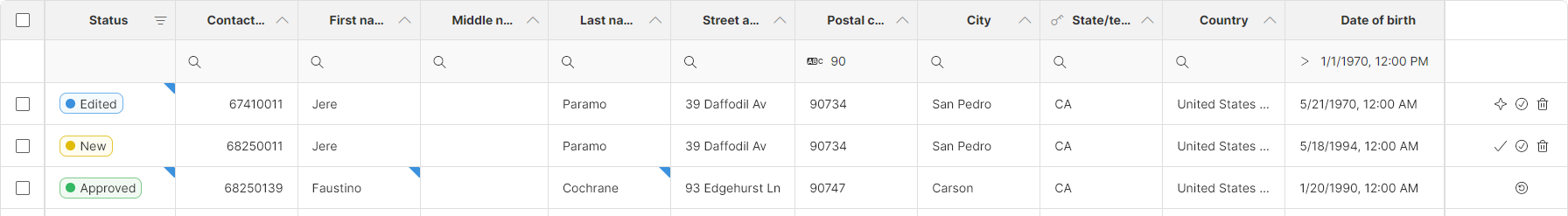
Figure 89. Data editor with expanded value filters showing filters on
Postal code and Date of Birth columns.Depending on the column type, you will be able to filter in different ways. Default filter for each column type is applied when you type a value into the box itself, additional filter types can be shown by clicking on the magnifying glass icon. Following table provides a summary of filtering options for different column types.
| Column type | Default filter | Additional filters |
|---|---|---|
string |
|
|
integer |
|
|
decimal |
|
|
date |
|
|
boolean |
|
No more options. |
|
|
No more options. |


Error filters
To allow you to quickly find rows which contain errors, you can use Errors only filter available in the toolbar:
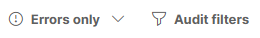
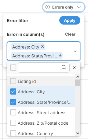
The *Errors only can be clicked to only show rows that contain error in any column. Alternatively, you can click on the down arrow to get additional options to filter based on errors in specific columns only:
The Errors only button will be highlighted in blue to make it easy to see that the filtering is enabled.
Audit filters
Audit filters allow you to filter rows based on changes made in the data. It allows you to, for example, find rows that were modified by certain user or at a certain time and so on.
The Audit filters configuration is available via toolbar:
Clicking on the Audit filters will show a configuration pop-up with the following settings:
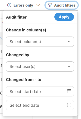
If multiple filters are configured above (e.g., you filter by column and user), they all must be satisfied for the row to be shown in the editor (e.g., specified user must have made a change in the specified column).
Configuring data editor columns
In wide data sets it can be useful to not show all columns all the time to simplify the navigation within the data. You can configure the current view and the columns that are shown in the data editor using the Column chooser dialog. This dialog can be shown by clicking on the *Column chooser icon in the toolbar:
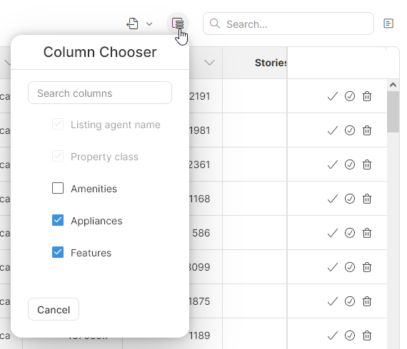
Note that not all columns can be shown or hidden. The ability to show or hide specific columns depends on how they are configured in the data set’s layout.
Columns that are set as Always visible in the data set layout cannot be hidden (like the Property class column on the screenshot above). Columns that are configured as Hidden are hidden by default but can be shown via the Column chooser (this are the Appliances and Features columns on the screenshot above).
Columns that are designed as Always hidden are not visible in this dialog at all and cannot be shown/hidden unless their settings in the data layout change.
To learn more about column visibility, please review the Data layout section.
Exporting data to Excel
To export your data to an Excel spreadsheet, you can use the Export action on the toolbar:
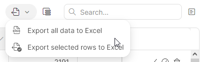
Two export options are provided:
-
Exporting everything (the whole data set)
-
Exporting just the selected rows
Both options produce output with the same formatting – a single Excel file in XLSX format. The file will contain a single worksheet with one header row and the rest taken by the data. The only difference between the two options is whether all data from the data set is included or just the selected rows.
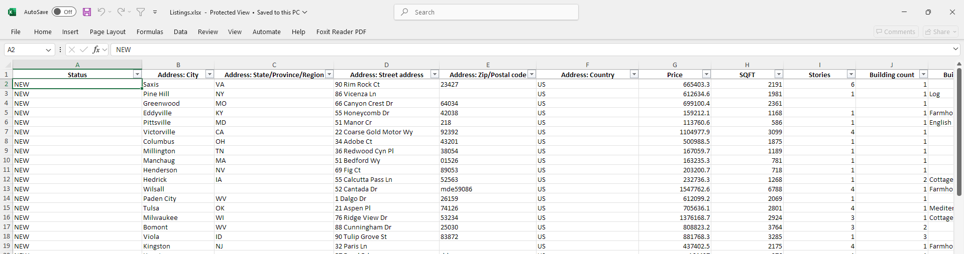
Figure 90. Data exported from the Data Manager via the Export to Excel function.
Audit log
Data Manager keeps track of all changes in the data in the Audit log. Audit log records information about who made the change (user), when was the change made and the actual change (column name, original value, and new value). This is kind of audit trail is kept for every column including the Status column.
The audit log is used to show the blue change markers in cells in the data editor – every cell with a change in the audit log gets the change marker.
To display the audit log of the current row, use the Audit log  icon on the toolbar. The audit log will be displayed in a side bar:
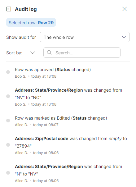
Figure 91. Audit log showing events for a single row.
The side bar allows you to filter the view if you are looking for a specific change. You can show audit for a selected column by selecting the column in Show audit for dropdown.
You can search for a specific event using full text search. This allows you to find specific value, user, or event type.
You can also change the sort order via the Sort by setting to sort by the time (the default) or by the person who made the change.
Note that the audit log side bar will show the audit of the current row. You can review logs of different rows simply by clicking on them in the data grid.