Version
Create new Data App
To create a new Data App and make it available for others, a Data Service has to be published on the CloverDX Server. Each published Data Service has a working preview of the Data App embedded into the Server Console UI under the Data App tab of the detail view. In order to make the Data App available for use outside the Server Console, you need to enable the Data App feature for the given Data Service. Data App can be enabled either through the action available in the context menu options or at the header of the Data App tab in the detail view.
The configuration of the Data Service also affects the Data App. Input elements are generated for each parameter based on their type in the order they are defined in the Data Service job. See the table below for more info about what kind of widget is generated for which type of parameter.
| Parameter type | Widget in Data App | Example screenshot |
|---|---|---|
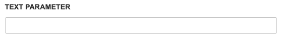
String |
A simple text box for a string value. |
|
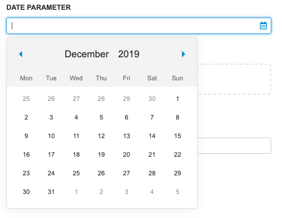
Date |
Text box with a calendar widget. Accepts values in YYYY-MM-DD HH:mm:ss format. The time portion is optional. For more information see the Date Input section. Date input widget accepts the following formats:
The date input converts the inserted values to ISO 8601 format in the Time zone of the CloverDX Server. Example: if the server timezone is +03:00 and the user selects the value '2019-05-05 05:05' then the value '2019-05-05T05:05:00.000+03:00' is sent to the Data Service. |
|
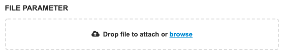
Binary or Text File |
File widget with browse and drag-and-drop functionality. Note: CloverDX version 5.5 does not distinguish Binary or Text files. Both types should be processed using request:part:[name] URL. Different type name is reserved for upcoming versions. |
|
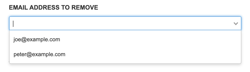
Enumeration |
Selection widget with predefined values. Can be configured to accept custom values. In that case, the value can be entered into the text box. |
|
Boolean |
Simple checkbox. The checkbox is not marked as required, but its value is always sent. |

|
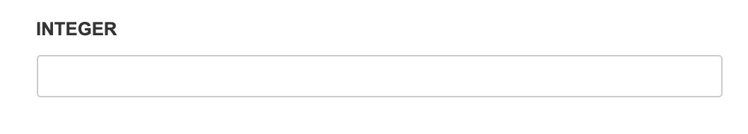
Integer |
Simple text field. Value is validated on submit. |
|
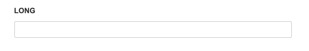
Long |
Simple text field. Value is validated on submit. |
|
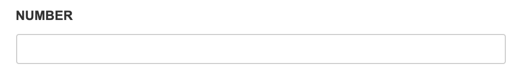
Number |
Simple text field. Value is validated on submit. |
|
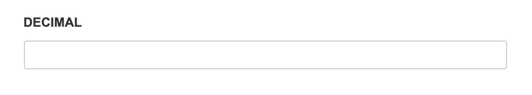
Decimal |
Simple text field. Value is validated on submit. |
|