Edit Component Dialog
| Commands |
| Attributes |
The Edit component serves for editing component attributes. This dialog is available in each component. You can access the dialog by double-clicking the component that has been pasted in the Graph Editor pane.
In the Edit component dialog you can edit attributes of a component. At the top of the window, there is a toolbar with several commands for attribute values. There are several groups of attributes below the toolbar.
Commands
Copy Property
Copies selected attribute value into the clipboard.
Paste Property
Pastes the value from the clipboard as a value of selected attribute.
Clear Property
Clears the value of the selected attribute.
Add Custom Property
Adds a custom attribute to the component.
Remove Custom Property
Removes the selected custom attribute from the component.
Use Parameter as Value
Opens a dialog to select an existing graph parameter as an attribute value.
Export as Graph Parameter
Export an existing attribute value as a graph parameter.
Attributes
In the Properties dialog, all attributes of the components are divided into 5 groups: Basic, Advanced, Runtime, Deprecated and Custom.
Two groups (Basic and Runtime) can be set in all of them.
The other groups (Basic, Advanced and Deprecated) differ in different components.
However, some of them may be common for most of them or, at least, for some category of components (Readers, Writers, Transformers, Joiners or Others).
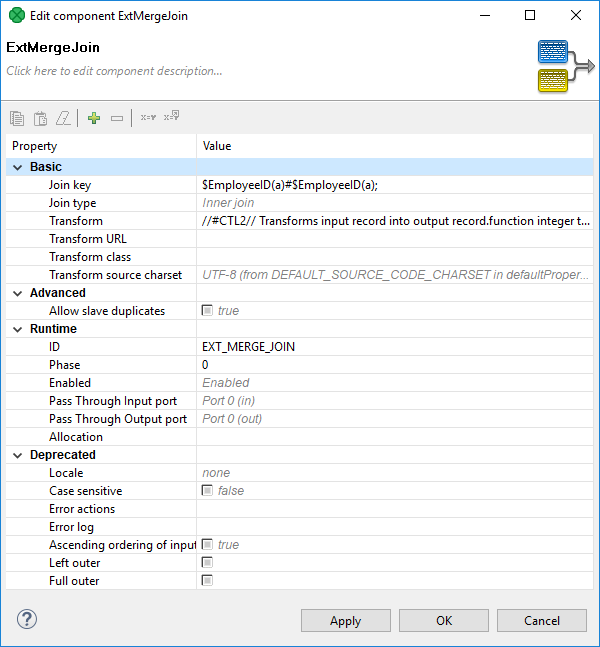
Figure 30.3. Edit Component Dialog (Properties Tab)
Basic
These are the basic attributes of the components. These attributes depend on the type of the component. They can be either required or optional.
They may be specific for an individual component, for a category of components or for most of the components.
Required - Required attributes are marked by a warning sign. Some of them can be expressed in two or more ways; two or more attributes can serve the same purpose.
Optional - They are displayed without any warning sign.
Advanced
These attributes contain complex (advanced) or specific use case related settings of the components.
Advanced attributes may be specific for an individual component, for a category of components, or for most of the components.
Deprecated
These attributes were used in older releases of CloverDX Designer and they still remain here and can be used even now. However we suggest you do not use them unless necessary.
May be specific for an individual component, for a category of components or for most of the components.
Custom
The Custom attributes are defined by the user. Use the button at the top of the dialog to add a new custom attribute.
Runtime
These attributes are also common for all components.
ID - a unique identifier of a component. If you check Generate component ID from its name in → → and your component is called e.g.
Write employees to XML, then it automatically gets the IDWRITE_EMPLOYEES_TO_XML. While the option is checked, the ID changes every time you rename the component.Component type - Describes the type of the component. By adding a number to this component type, you can get a component ID.
Specification - Describes the function of the component. It cannot be changed.
Phase - An integer number of the phase to which the component belongs. All components with the same phase number run in parallel. And all phase numbers follow each other. Each phase starts after the previous one has terminated successfully; otherwise, data parsing stops.
For more detailed description, see Phases.
Enabled - Specifies whether the component should be enabled, disabled or whether it should run in a passThrough mode. This can also be set in the Properties tab or in the context menu (except the passThrough mode).
For a more detailed description, see Enable/Disable Component.
Pass Through Input port - If the component runs in the passThrough mode, you should specify which input port should receive the data records and which output port should send the data records out. This attribute serves to select the input port from the combo list of all input ports.
Pass Through Output port - If the component runs in the passThrough mode, you should specify which input port should receive the data records and which output port should send the data records out. This attribute serves to select the output port from the combo list of all output ports.
Allocation - If the graph is executed in Cluster, this attribute must be specified in the graph.
For more detailed description, see Component Allocation.
![[Important]](../figures/important.png) | Important |
|---|---|
Java-style Unicode expressions Remember that since version 3.0, you can also use the Java-style Unicode expressions anyway (except in URL attributes).
You may use one or more Java-style Unicode expressions,
for example:
Such expressions consist of series of the They may also serve as delimiter (like CTL expression shown above, without any quotes):
|