Chapter 13. Configuration

Figure 13.1. CloverDX Server Integration
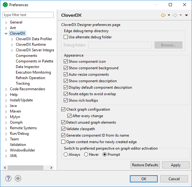
Show component icon
Show component icon switches component icons on or off.
Default: enabled

Figure 13.2. Show component icon: enabled

Figure 13.3. Show component icon: disabled
Show component background
Show component background enables or disables the background color of components.
Default: enabled

Figure 13.4. Show component background: enabled

Figure 13.5. Show component background: disabled
Show component description
Show component description displays the component description in a graph.
Default: enabled

Figure 13.6. Show component description: enabled

Figure 13.7. Show component description: disabled
Route edges to avoid overlap
Route edges to avoid overlap enables different edge-routing algorithm.
Default: enabled
Show rich tooltips
Show rich tooltips enables more content to tooltips on edges.
Default: enabled

Figure 13.8. Show rich tooltips: enbled

Figure 13.9. Show rich tooltips: disabled
Check graph configuration
Check graph configuration enables checking the graph configuration. Without checking, errors on components are not displayed.
Default: enabled
Detect unused graph elements
Detect unused graph elements enables updates and reporting of used/unused graph elements. Disabling can solve some specific performance issues.
Default: enabled
Generate component ID from its name
Generate component ID from its name generates component identifier based on name.
Default: enabled
Open context menu for newly created edge
Open context menu for newly created edge opens context menu after creating an edge between two components. In this context menu, you can select metadata for the edge.
Default: enabled

Figure 13.10. Open context menu for newly created edge: enabled
