Chapter 13. Configuration

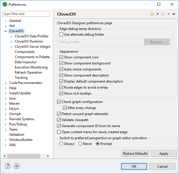
Figure 13.1. CloverDX Server Integration
Table 13.1. General configuration
| Option | Description | Default Value |
|---|---|---|
| Show component icon | Switches component icons on or off. | enabled |
| Show component background | Enables or disables the background color of components. | enabled |
| Auto-resize components | Automatically adjusts components' size to fit their name. | enabled |
| Show component description | Displays or hides components' description in a graph. If Display default component description is disabled, only user-defined description is visible. | enabled |
| Display default component description | When Show component description is enabled, it shows the components' default description (e.g. path to the file in Readers or Writers). | enabled |
| Route edges to avoid overlap | Enables or disables different edge-routing algorithm. | enabled |
| Show rich tooltips | Enables or disables detailed tooltips on edges. | enabled |
| Check graph configuration | Enables or disables graph configuration check. Without checking, errors on components are not displayed. | enabled |
| Detect unused graph elements | Enables or disables updates and reporting of used/unused graph elements. Disabling can solve some specific performance issues. | enabled |
| Validate classpath | Checks whether the content of the classpath file is valid for both Designer and Server. Can be disabled in case it significantly slows down the working process (opening new projects, etc.) or indicates false positives. | enabled |
| Generate component ID from its name | Generates component identifier based on its name. | enabled |
| Open context menu for newly created edge | Opens the context menu after creating an edge between two components. In the menu, you can select metadata for the edge. | disabled |
